Leave Your Message

How to Choose Decorative Items for Your Home?

A home feels finished through details: a linen cushion on a worn chair, a ceramic bowl catching afternoon light, or a lamp that softens a dark corner. Choosing decorative Items is not simply about matching colors. It means balancing scale, texture, function, and the way a room is actually used. The phrase “corative Items” may look unusual, but the central question is familiar: which objects make a home feel more considered without making it feel crowded?

Spending reports offer useful context, though they cannot decide personal taste. Houzz’s 2024 U.S. Houzz & Home Study reported a median home renovation spend of $24,000 in 2023, up from $22,000 in 2022. That figure covers renovation projects, not decorative purchases alone; it signals broader household investment rather than a decor budget. A room can still change noticeably with one well-placed mirror or a carefully chosen rug. Sometimes the expensive piece is the wrong one.

This guide will help readers assess proportion, material, color, lighting, and practical needs before buying. It will also consider how to mix personal keepsakes with new pieces, choose items for different rooms, and avoid clutter. Measurements matter. So does patience. Even a thoughtful choice may look different at home than it did in a showroom, and that is worth admitting. The aim is not a perfect room, but a more comfortable one.
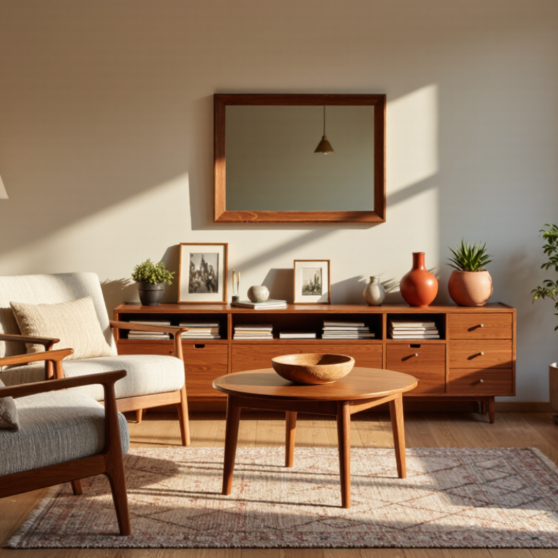
How to Choose Decorative Items for Your Home?

Define Your Room’s Needs, Style, and Existing Features

Before choosing decorative items, identify what the room must do. A living room used for reading needs clear light, a reachable side table, and space to walk past the sofa. A narrow entry may need a shallow bowl for keys, not another floor-standing object.

Measure twice. Note fixed features such as window trim, flooring, fireplace stone, and cabinet hardware; their colors and textures already shape the room. Take a photo in daylight, then check it again at night. Warm bulbs can make a pale wall look cream, while cool daylight reveals its gray undertone.

Next, choose a style direction that works with those existing features rather than competing with them. Repeat one or two colors, and vary materials: a linen cushion beside a smooth ceramic vase can add contrast without clutter. Leave breathing room.

Houzz’s 2024 U.S. Houzz & Home Study reported that 54% of surveyed homeowners renovated in 2023, with median renovation spending of $24,000. Those figures concern renovation, not decor, but they underline the value of making considered choices around a room’s lasting elements.

In practice, test a small object before buying a matching set. I have seen a carefully chosen tray feel too large once placed on a real coffee table; measurements help, but they do not replace living with the arrangement for a day.

Assess Scale, Proportion, and Available Space

Before choosing decorative items, measure the surface or wall where they will go. A vase that looks modest in a shop may overwhelm a narrow console. Note the furniture’s width, depth, and height, then compare those figures with the item. Leave usable space around objects, especially near doors, lamps, and seating. Measure twice. It saves guesswork.

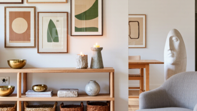
Think about proportion, not just size. A small picture can disappear above a wide sofa, while one oversized artwork may make a compact room feel crowded. As a practical guide, group objects in varied heights, such as a low bowl beside a taller vase. Keep the tallest piece from blocking a view or competing with a nearby light. Painter’s tape can mark a planned artwork’s edges on the wall before you commit.

Available space includes visual breathing room, not only empty inches. On a bookshelf, leave some shelves partly open so books and objects do not read as clutter. On a coffee table, keep a clear area for cups and everyday use. I sometimes find a carefully measured arrangement still looks stiff; shifting one object slightly can help, though the “right” balance is partly personal. Step back from the doorway and check how the pieces relate to the room as a whole.

How to Choose Decorative Items for Your Home: Assess Scale, Proportion, and Available Space

A common decorating guideline is to keep a display grouping around two-thirds the width of the furniture beneath it. The values below apply that proportion to example furniture widths; use them as a starting point, not a fixed rule.

Choose Colors, Materials, and Decorative Themes

Color, material, and theme work best when they respond to the room rather than a passing trend. Notice how daylight changes across the day: a muted green may look calm at noon but gray near dusk. Test paint or fabric samples beside your sofa and curtains before choosing decorative pieces. Two or three related colors usually feel settled; one small contrast, such as a rust-colored cushion, keeps the room from looking flat.

Tips: Mix textures, not too many patterns. Pair a smooth ceramic bowl with a woven basket or a linen lampshade. Check that materials suit your routines: glass needs regular wiping, while unfinished wood can show marks. That may be fine, but it is worth considering before buying.

Choose a loose theme, such as coastal, botanical, or vintage, rather than matching every object. A shell print, pale wood, and blue glass can suggest a coastal feel without turning the room into a set. Leave some surfaces open. I once added several small ornaments to a shelf, and each seemed appealing alone; together, they looked busy. Removing two helped, though the shelf still feels slightly bare to me. That tension is useful: live with an arrangement for a few days, then adjust what catches your eye.

How to Choose Decorative Items for Your Home? - Choose Colors, Materials, and Decorative Themes

Decorative Theme Suggested Colors Suitable Materials Decorative Items Where They Work Well Practical Styling Tip
Warm Minimalist Warm white, beige, soft taupe, muted brown Unfinished or lightly finished wood, linen, ceramic, wool Simple ceramic vases, neutral cushions, a wooden bowl, textured throws Living rooms, bedrooms, entryways Choose a few useful pieces with varied textures rather than filling every surface.
Scandinavian-Inspired White, pale gray, light blue, soft green, natural wood tones Light wood, cotton, wool, glass, matte ceramic Woven baskets, simple candleholders, framed prints, soft cushions Living rooms, dining areas, home offices Keep the base palette light and add color through small, easy-to-change accents.
Coastal White, sand, sea blue, sage, muted aqua Cotton, linen, rattan, seagrass, driftwood-style wood Woven trays, striped cushions, glass vessels, landscape art Living rooms, bedrooms, bathrooms Use natural textures and a restrained blue accent instead of relying on nautical symbols.
Industrial Charcoal, black, warm gray, rust, deep brown Metal, reclaimed wood, leather, concrete, clear glass Metal wall art, sturdy table lamps, framed monochrome prints, textured cushions Living rooms, dining areas, loft-style spaces Balance harder finishes with fabric or wood so the room feels comfortable.
Nature-Inspired Olive, moss green, clay, cream, muted brown Wood, stoneware, jute, linen, natural-fiber baskets Houseplants, botanical prints, woven baskets, stoneware planters Living rooms, kitchens, sunrooms Consider available light and plant-care needs before choosing live greenery.
Eclectic A flexible mix anchored by two or three repeating colors A thoughtful mix of wood, textiles, metal, glass, and ceramic Collected art, patterned cushions, distinctive lamps, decorative objects Living rooms, creative workspaces, reading corners Repeat a color, material, or shape in several places to make varied pieces feel connected.

Select Items That Balance Function and Visual Interest

Decorative items feel more natural when they earn their space. A shallow bowl on an entry table can hold keys, while its glaze adds a small patch of color. A reading lamp brings warmth and makes a chair useful after sunset. Choose pieces that suit the habits of the people who live there, not just the shape of an empty shelf. Useful can be beautiful.

Pay attention to scale and placement. A tall vase may balance a low cabinet, but it should not block a window or crowd a walkway. Group a few objects with different heights, such as a framed photograph, a small plant, and a smooth stone dish. Leave some open space around them. It helps each piece stand out. In my own rooms, I have sometimes kept an object simply because it looked good, then realized it collected dust and served no purpose. That is worth reconsidering. Ask whether an item is comfortable to use, easy to maintain, and pleasing from the places where you spend time. If the answer is only “it looks nice,” try moving it before buying another piece.

Arrange, Edit, and Maintain Your Decorative Pieces

Decorative pieces work best when they support how a room is used, not just how it photographs. Start by grouping objects with a shared color, material, or story. On a console, a low bowl, a framed print, and one taller vase create varied heights without blocking the view. Leave breathing room. A crowded shelf can make even beautiful objects feel like clutter.

Tips: Place larger pieces first, then add smaller accents. Step back from the doorway to check the balance. Keep everyday items within reach, and move fragile objects away from busy paths.

Edit the arrangement after living with it for a week. If you never notice an object, or keep moving it to clean, it may not belong there. I still sometimes keep a souvenir because it carries a memory, even when it disrupts the palette; that can be a fair trade. Dust ceramics and frames with a soft cloth, and check hanging hardware occasionally. Rotate seasonal pieces rather than adding more storage. Sunlight can fade textiles and paper, so shift them away from bright windows. Small changes are easier to maintain than a full-room reset.